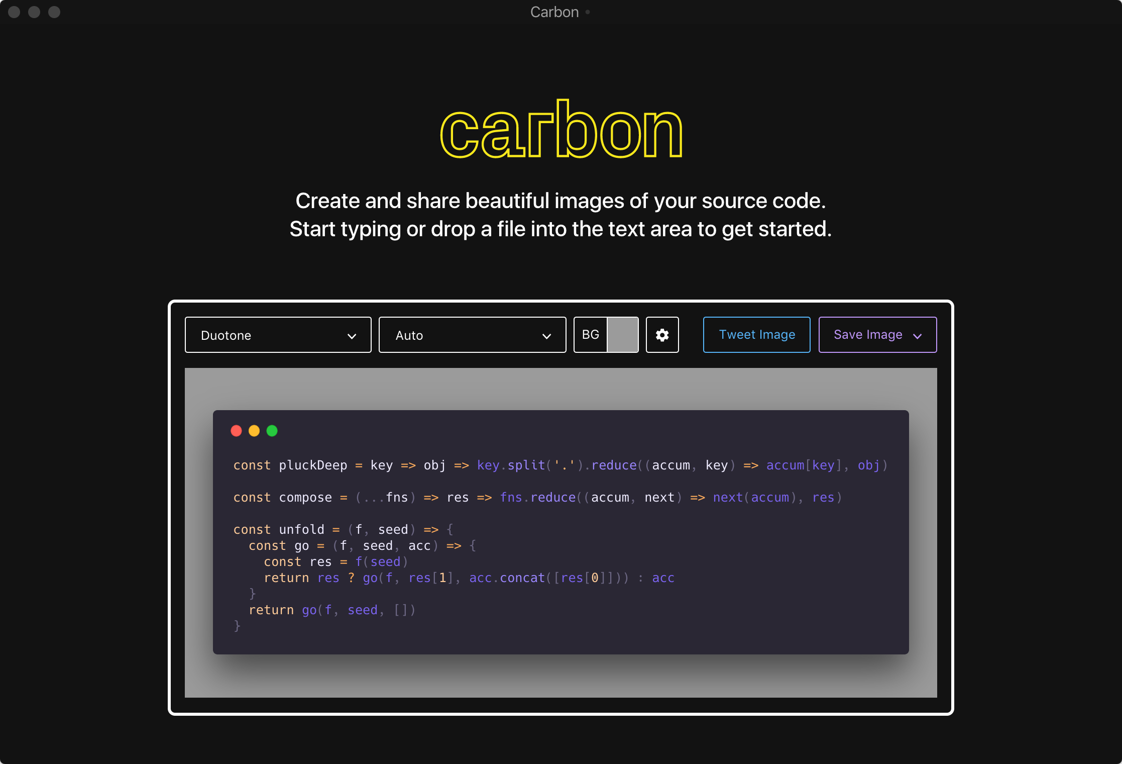
The developer community is constantly changing and with it, the way we share and interact with each others code does too. Carbon improves upon that. It’s the easiest way to create and share beautiful images of your code.
Introduction
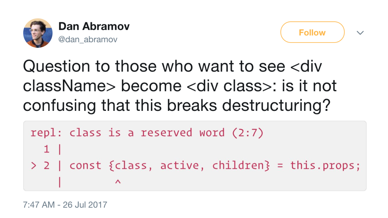
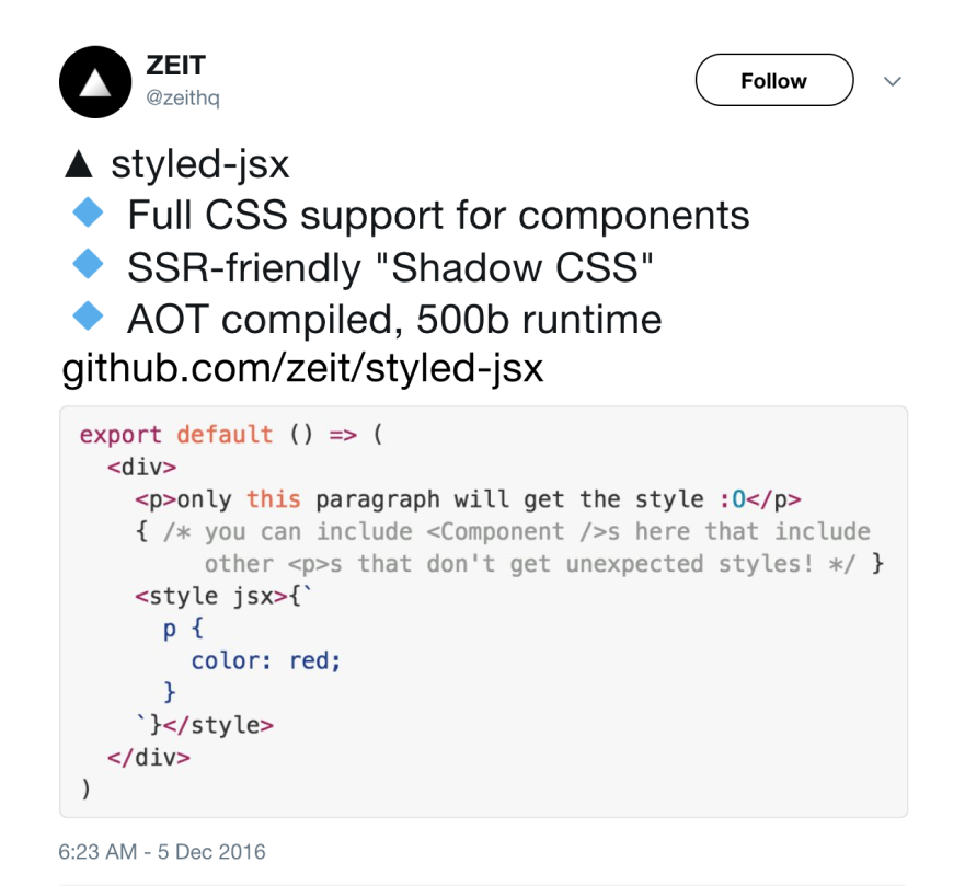
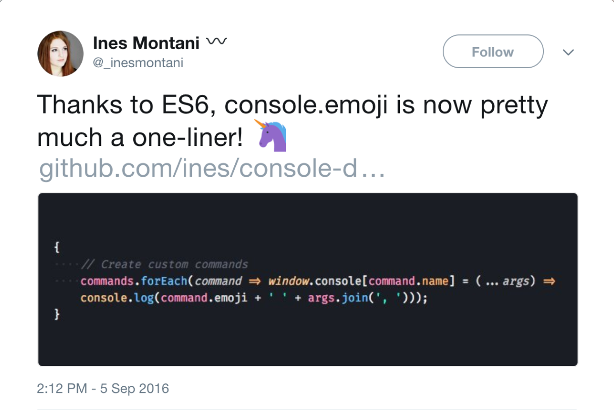
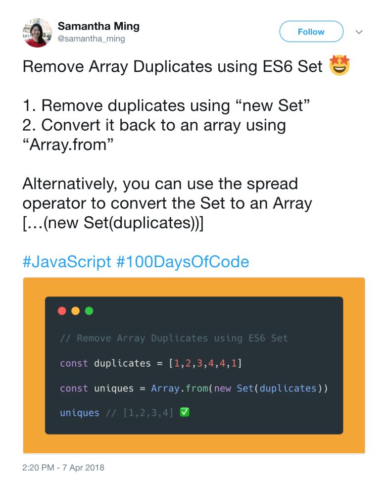
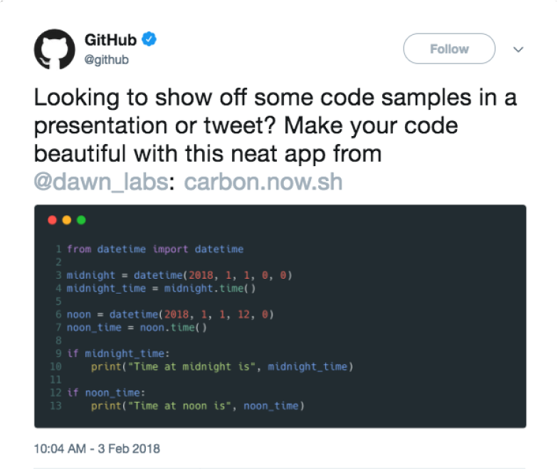
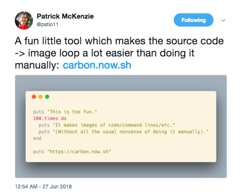
After seeing this tweet we thought to ourselves: "why can't all the code we share look this good?" We noticed this was a common problem on Twitter—developers would share unformatted snippets of code that were often hard to read, at worst unnoticeable.
Branding
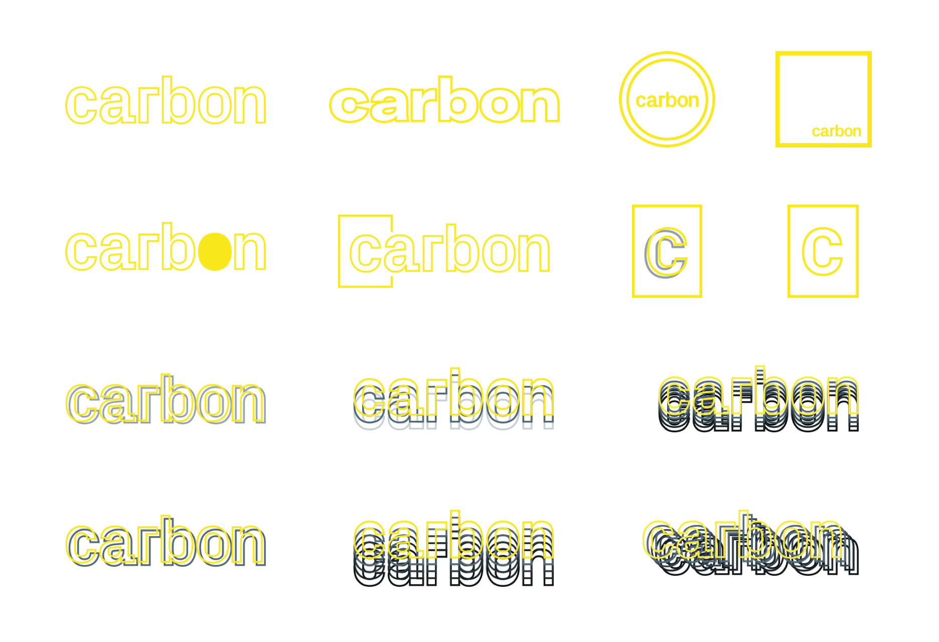
We wanted the brand to be somewhat nature-inspired, following the roots put down by our own name, but carry a more technical and precise feeling. We think “Carbon”, the chemical element that makes up most things, living and not, does just that. The phrase “carbon copy” also plays along well.
Site Explorations
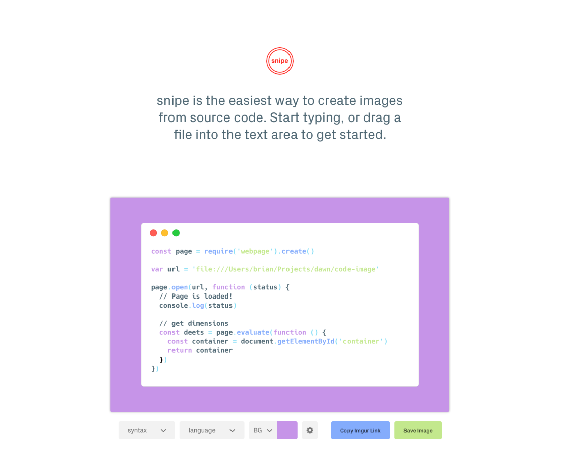
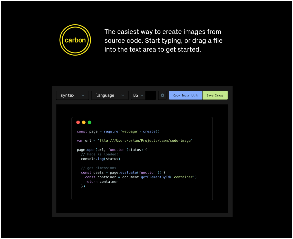
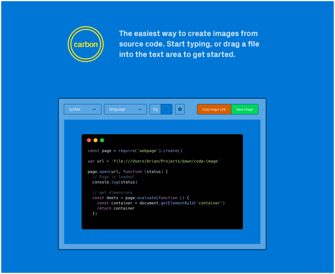
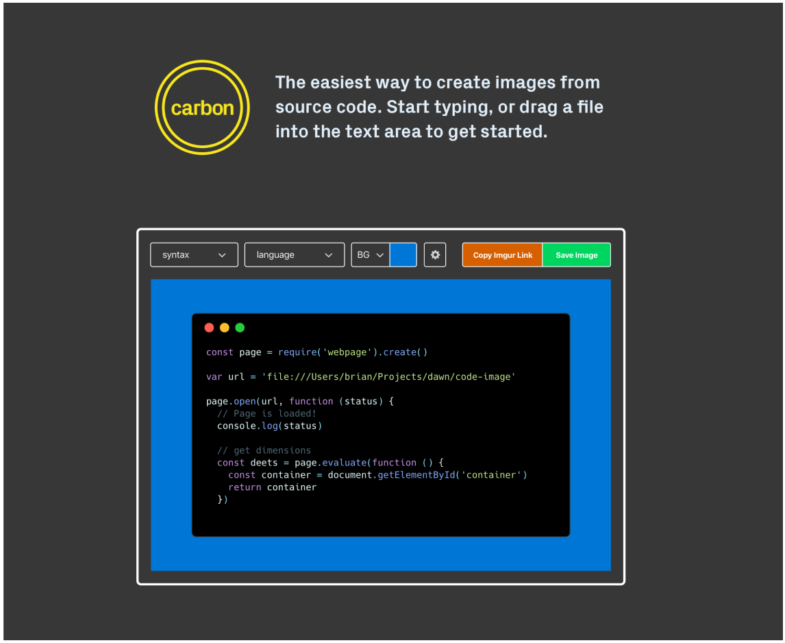
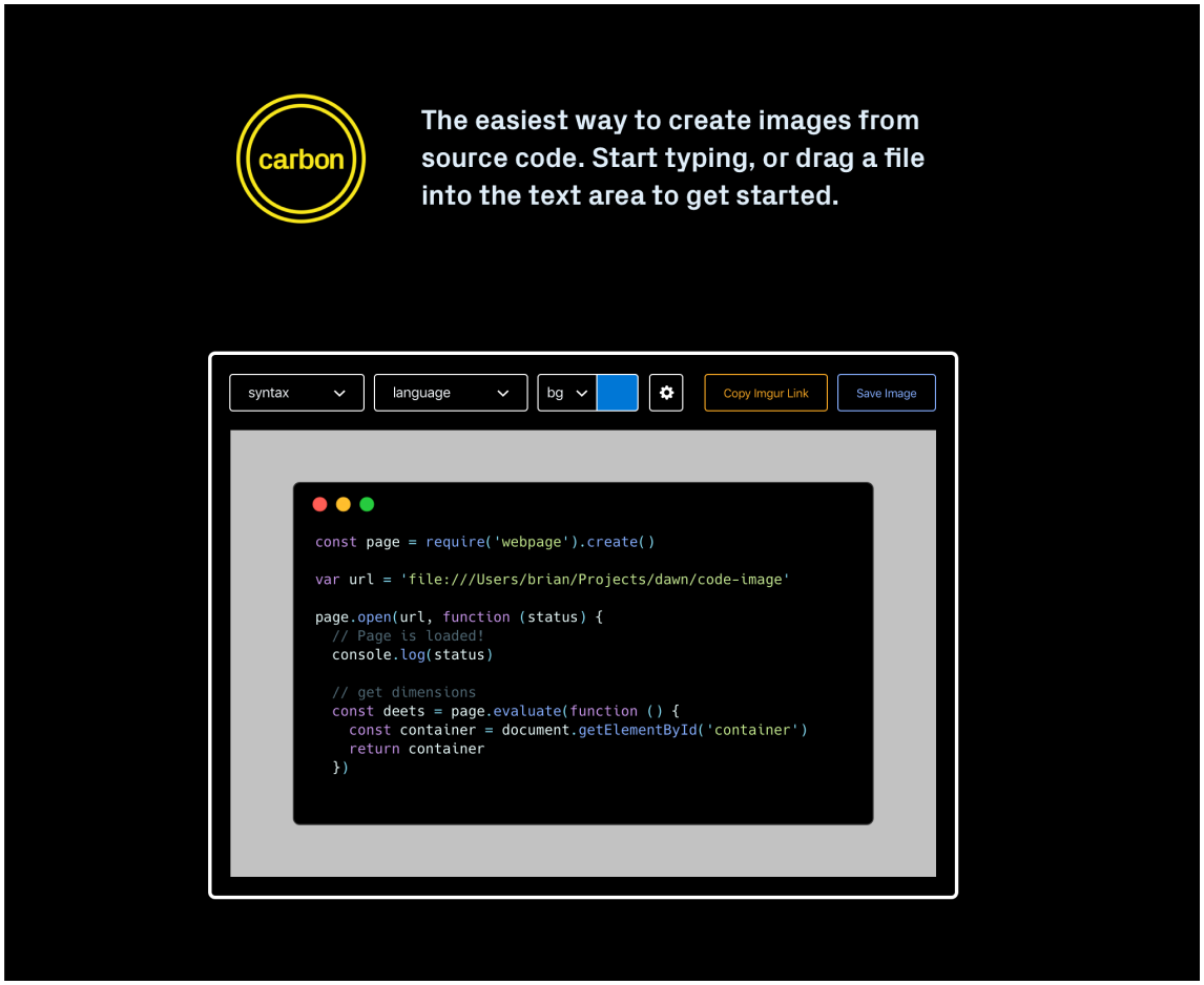
Once we had the name finalized, we iterated on a few different site design ideas before landing on the design that's currently live on the site.
Launch
With the success of the launch, we were lucky enough to have feedback pouring in almost immediately. Whether from Twitter, GitHub issues, emails or in-person conversations, almost everyone seemed to have ideas about how to make the project even better. We were diligent about listening to feedback, adding in several requested ideas like image backgrounds and SVG export. It was a great example of the value in launching early as many of the features users requested we'd never have come up with ourselves. Thanks to community feedback and contributions, Carbon today remains a vibrant open-source project.

What about now?
Carbon currently has 20,000+ stars on GitHub and 50,000+ monthly active users. Numbers are great, but we're just happy to see so many developers reaching for Carbon to easily share their code.
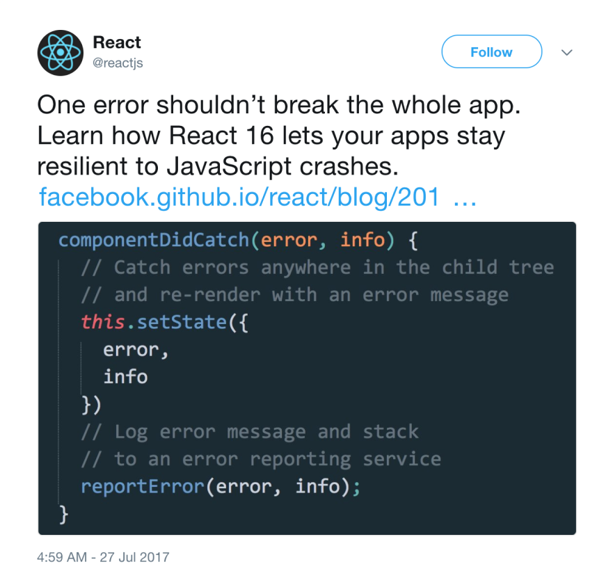
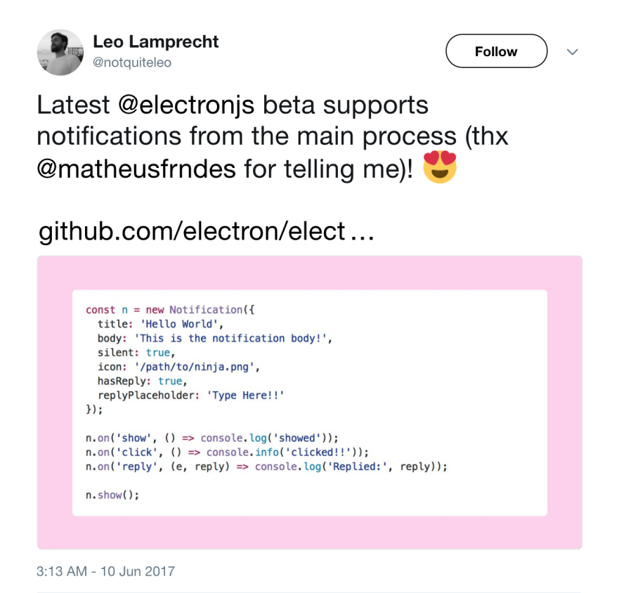
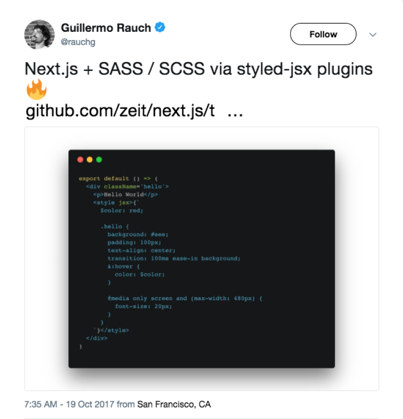
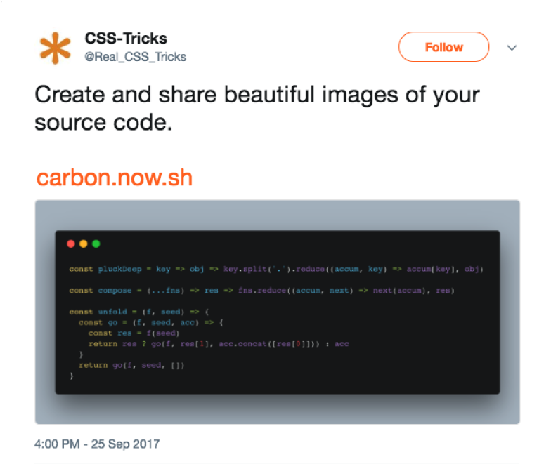
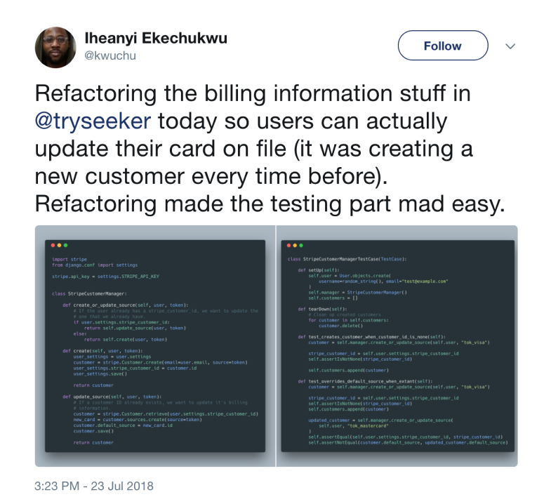
Remember that initial tweet? This one looks pretty similar, except hopefully it was a lot easier to make, with Carbon.
We want to thank ZEIT for hosting Carbon.
